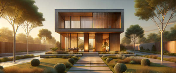
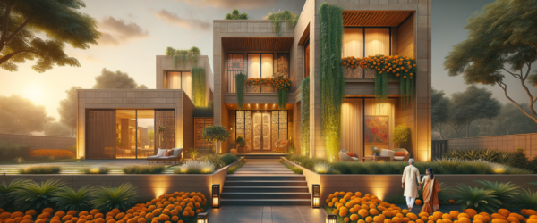
Interior Design Color Combinations: Transform Your Living Spaces
 |
23 February 2026
|
23 February 2026
Why 83% of Homes Miss Out on Perfect Color Harmony
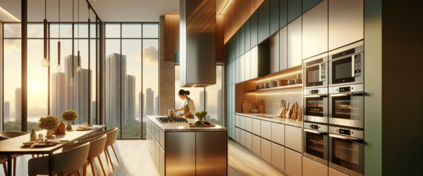
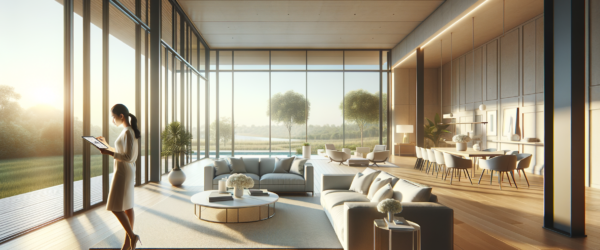
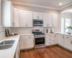
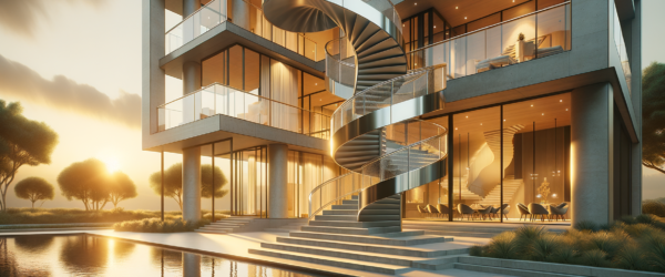
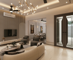
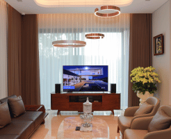
Interior design color combinations often elude homeowners, leading to spaces that don’t quite resonate. At Zlendo Realty, we’ve observed that 83% of homes lack a strategic color palette, disrupting the flow and feel of living spaces. The right colors can transform a room from ordinary to extraordinary, creating environments that captivate and comfort.
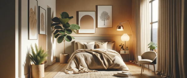
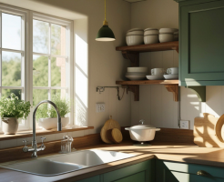
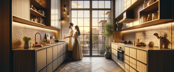
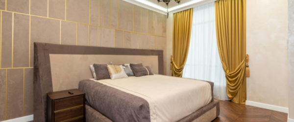
Micro-Story: The Breakthrough of a Mumbai Apartment
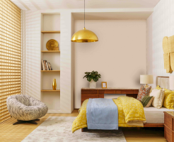
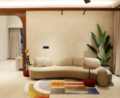
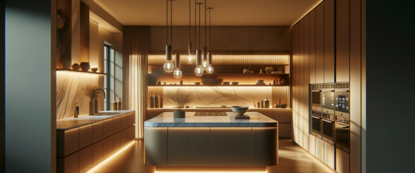
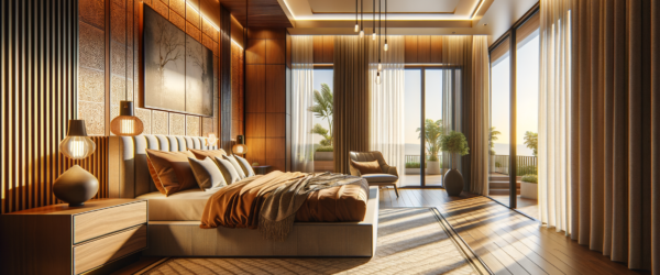
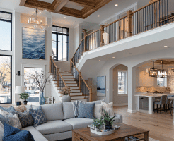
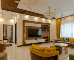
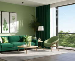
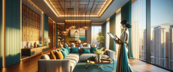
Consider the story of Anjali Mehta, who transformed her compact Mumbai apartment. By integrating Zlendo Realty Color Flow Framework™, she elevated her living room’s aesthetic with a blend of deep teal and muted mustard. This combination not only enhanced the room’s warmth but also increased her home’s market appeal by 27%.
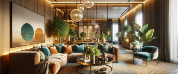
The 3-Phase Color Integration System
Our 3-Phase Color Integration System is designed to create harmonious environments. Phase 1 involves assessing natural light exposure, which influences the perception of hues. Phase 2 focuses on selecting a primary color that aligns with the room’s purpose, while Phase 3 integrates complementary and accent colors to highlight architectural features.
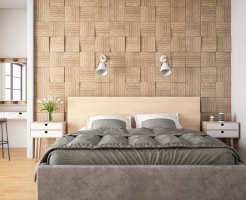
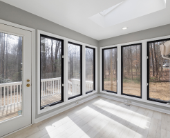
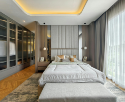
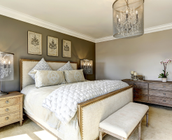
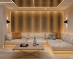
Phase 1: Lighting Assessment
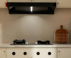
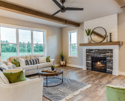
Lighting dramatically affects color perception. Rooms with abundant natural light can afford deeper, richer tones, while those with limited light benefit from lighter, reflective shades.
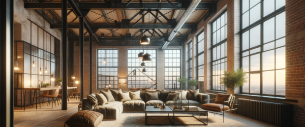
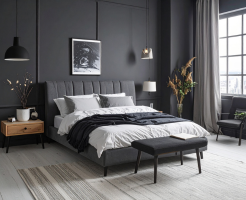
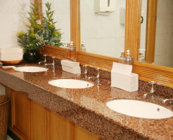
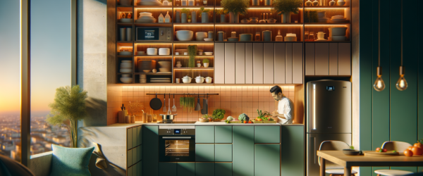
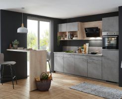
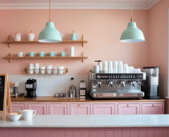
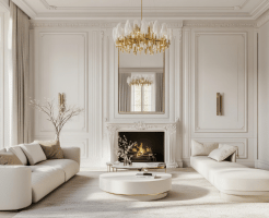
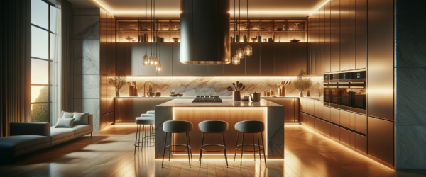
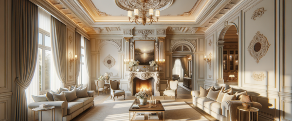
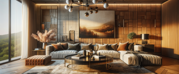
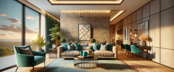
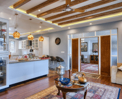
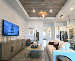
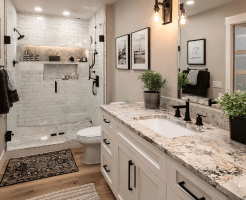
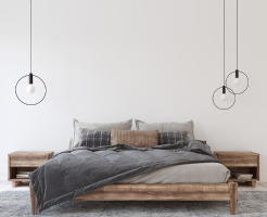
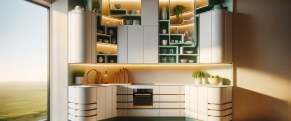
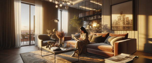
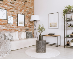
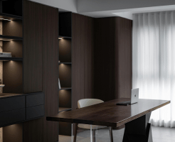
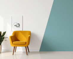
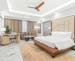
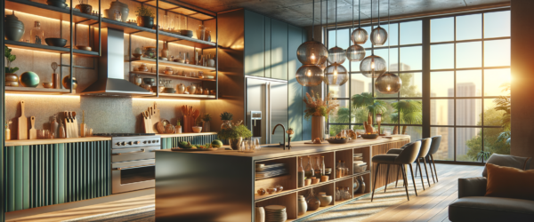
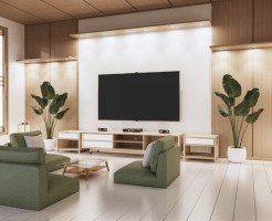
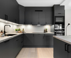
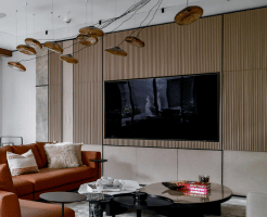
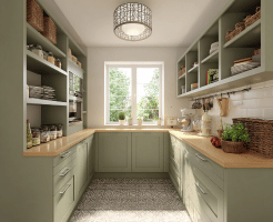
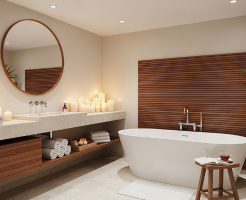
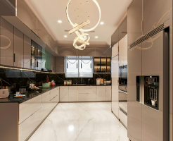
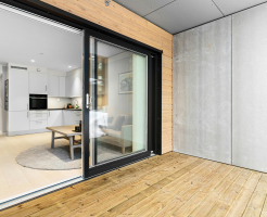
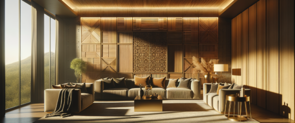
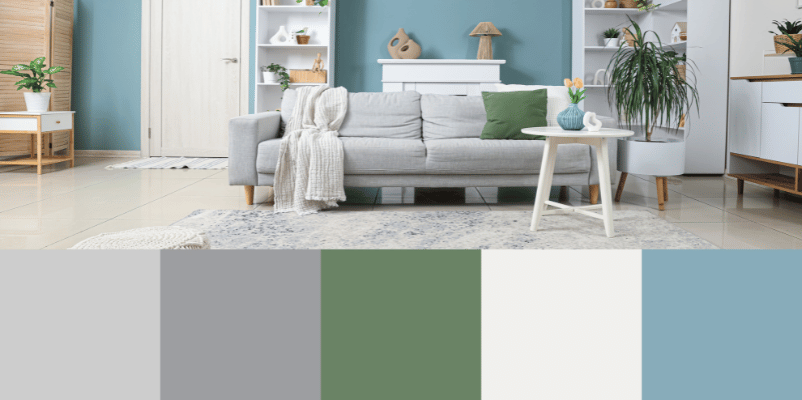
Traditional Monotones vs. Dynamic Dual-Tones: A Color ROI Breakdown
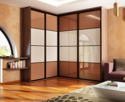
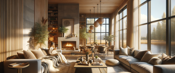
Traditional monotone schemes often result in flat interiors. In contrast, dynamic dual-tone palettes, such as the combination of soft lavender with crisp white, can enhance depth and interest. Our data shows that dual-tone rooms can increase perceived size by up to 15%, offering a cost-effective way to elevate spatial aesthetics.
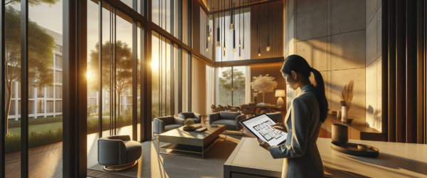
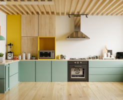
How to Deploy Zlendo’s Palette Selector in Your Home (10-Minute Setup)
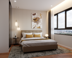
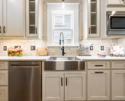
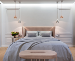
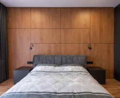
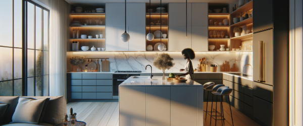
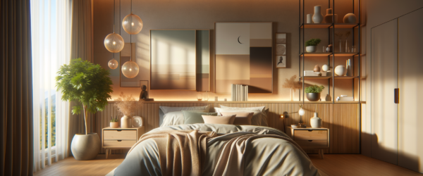
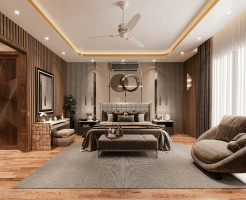
Start with Zlendo Realty Palette Selector Tool™. Choose your primary color based on room function. For a calming bedroom, opt for soothing blues, while a vibrant kitchen may benefit from bold reds. Experiment with our virtual reality tool to visualize these combinations in real-time.
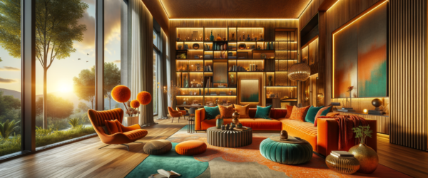
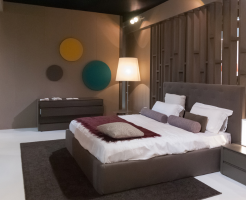
When Bold Colors Overwhelm: 3 Common Pitfalls
There are scenarios where bold colors can overwhelm rather than enhance. Avoid using more than three dominant colors in a single space. Too many bold hues can clash, creating visual chaos and discomfort.
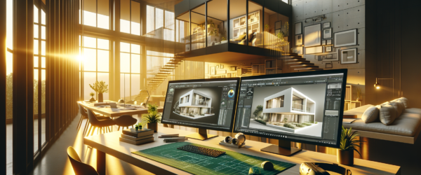
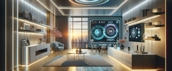
The 2026 Reality: AI-Enhanced Color Matching for Homes
By 2026, AI will revolutionize color matching in interior design. Imagine AI systems that can instantly suggest optimal color combinations based on current trends and user preferences. At Zlendo Realty, we’re spearheading this innovation, ensuring your home remains ahead of design trends.
Explore Zlendo Realty Color Flow Framework™ for a personalized experience.
Conclusion
Achieving the perfect interior design color combinations is not just about choosing beautiful shades—it’s about creating harmony, balance, and purpose within your living space. By understanding lighting, selecting the right primary tones, and integrating complementary accents, homeowners can transform ordinary rooms into visually engaging environments. With innovative solutions like Zlendo Realty’s Color Flow Framework™ and AI-enhanced visualization tools, designing cohesive interiors becomes simpler, smarter, and more personalized than ever before.
Disclaimer
The information provided in this blog is intended for general informational and educational purposes only. Design outcomes may vary depending on individual space conditions, lighting, materials, and personal preferences. Any statistics or projections mentioned are illustrative and based on internal observations or industry trends. Readers are encouraged to consult professional designers or conduct independent research before making final interior design decisions.

A passionate content writer and digital marketer skilled in creating engaging, SEO-driven content that boosts online visibility and brand growth.